Website Refresh 2023
November 27, 2023
This is my first personal website where I am not describing myself as a front-end developer. It feels weird because being a developer is what I most identify with.
Over the last few years, I've gradually shifted from being hands-on with code to focusing more on helping early-stage tech startups in building and promoting their products (let me know if you’re interested in reading more about this transition).
So, this new website is a reflection of that shift.
Here's what I knew I wanted from the start:
- Minimal: Easy to maintain and scale.
- Personal: The website is about me, so yes, you'll see my face on it.
- Storytelling: As I do a lot of this, I wanted the website to reflect that ability.
With that in mind, I began searching for inspiration.
What Inspired Me
I spent ages looking for things that inspired me. Ultimately, I was inspired by two categories:
Aesthetic
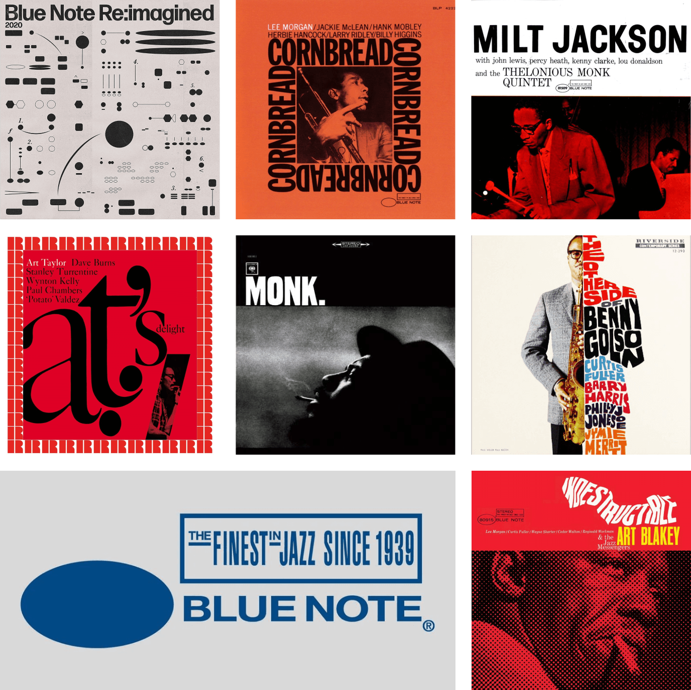
I've always been a fan of jazz record designs, so I decided to use that as my primary source of inspiration.
Storytelling
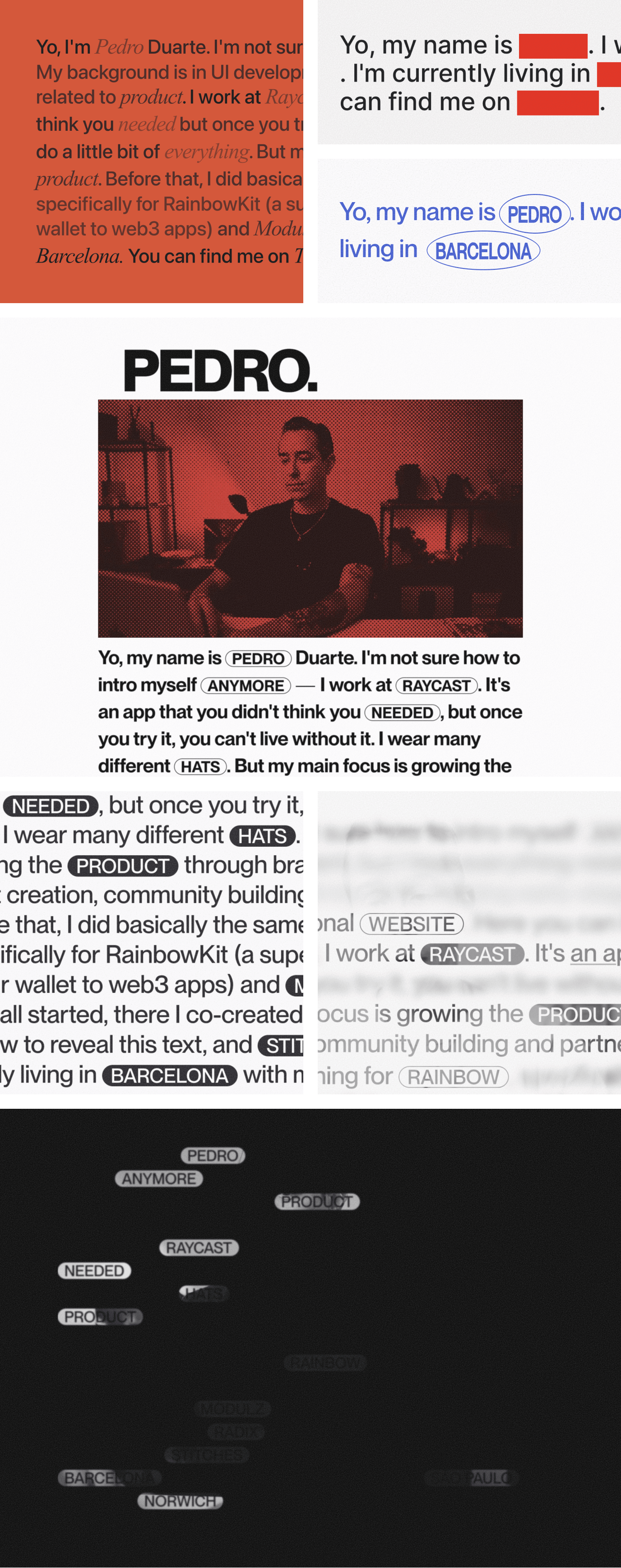
In terms of storytelling, I was greatly inspired by Los Feliz Engineering. LFE excelled at chunking the story, making it easier to read and allowing users to control what they want to delve into. I'm also a big fan of Benji and all his work.
Another site that grabbed my attention was Hakuna Matata. It has clean and unified typography, with a nice detail of showing the image behind the text using blend modes.
Sources
Here's a list of sources where I found inspiration:
For the Jazz album covers, I just searched on Google and Spotify.
Putting It Together
The result is a mix of most of the elements above: the orange accent from Lee Morgan's "Cornbread," the font pairing inspired by Milt Jackson's cover, the blurry monochrome vibe from Thelonious Monk's "Monk", the click-to-reveal storytelling approach of LFE, and the blended background from Hakuna Matata.
How It's Built
Nothing groundbreaking, but here's the tech stack:
- Frontend: Next.js 14
- Content SDK: Contentlayer
- Design System: Radix Themes
- Collapsible Component: Radix Primitives
- Home Video Hosting: BunnyCDN
- Home Video Optimizer: Cloudinary
- Hosting: Vercel
- Analytics: Fathom
The design is so straightforward that I wanted to put extra effort into the typography. I'm using the following fonts:
- Serif Font: Editorial New
- Sans Serif Font: Neue Montreal
Both licenses were purchased from Pangram Pangram for a total of $200. Initially, I wanted to use variable fonts and play around with different axes, but the licenses for those were a bit too steep for a personal website.
Iterations
It took many iterations to arrive at this final version. I find that's always the case with simpler designs.
I experimented with each direction in different branches, then pushed to Vercel. So I have a history of all the iterations I went through.
- Initial version: Basic proof of concept. Wanted to check if Radix Collapsible was a good fit for the website.
- A splash of orange: Testing if the orange background works. I liked it, but it felt too much.
- Multiple paragraphs: Decided to split up the paragraphs onto different lines, rather than one long line.
- Colour coding: Tried adding more colour to the different sections. Nah.
- Red blocks: Turned up the mystory knob to 11. Too much.
- Oval buttons: Blue Note inspired buttons. I actually liked them, but they didn't fit the overall vibe.
- Pill buttons: Starting to take shape from here. The buttons are now in a pill.
- 90's hardcode: Not sure what I was thinking here.
- Dark mode v1: Switched to a dark mode. This is where things started to click.
- Almost there: At this point I decided to show all of the text at once, then reveal the relevant parts. I wanted Los Feliz Engineering to be an inspiration, and not necessarily have the same UX. I was happy with this version, but was missing the final touch.
Cheers, Fam
Shoutout to my friends who have been patient enough to listen to me ramble about this website for the last few weeks and provided feedback along the way: Clara, Yuriy, Ennio, Vlad, Benoît, Ivan, Thomas, Bruno, Mariana, Danilo, Linus, and Mike.