Building the UI for The Times
March 30, 2016
The shiny new The Times and The Sunday Times has just been released. I thought it would be a good idea to write an article about the UI structure.
My name is Pedro Duarte and I’m a front-end developer specialising in UI and user experience. News UK hired me to focus on the UI development overhaul of the new The Times & The Sunday Times websites. And for the last year, this is what I’ve been up to…
In this article, I will write about the following:
- Overview
- Collaboration
- UI Structure
- CSS
- Refactor
- Visual QA
- Styleguide
- Conclusion
Overview
The redesign of The Times and The Sunday Times is all about content. It is about showing the right piece of news in its dedicated amount of space on the screen. The challenge of keeping this sort of strict hierarchy in a responsive layout determined by content can be difficult.
Redesigning and rebuilding a new website for such a large organisation is not an easy task. I don’t mean this in a technical sense. With so many people who care about the product, conflicting opinions and ideas are part of day-to-day. The key here is to not let yourself become emotionally attached to your code. Kill your babies.
Collaboration
To build the UI in the most appropriate way, I wanted to really understand the design. The first thing I did was sit down and go through all the designs with Kyle Wheeler — the lead designer of the project.
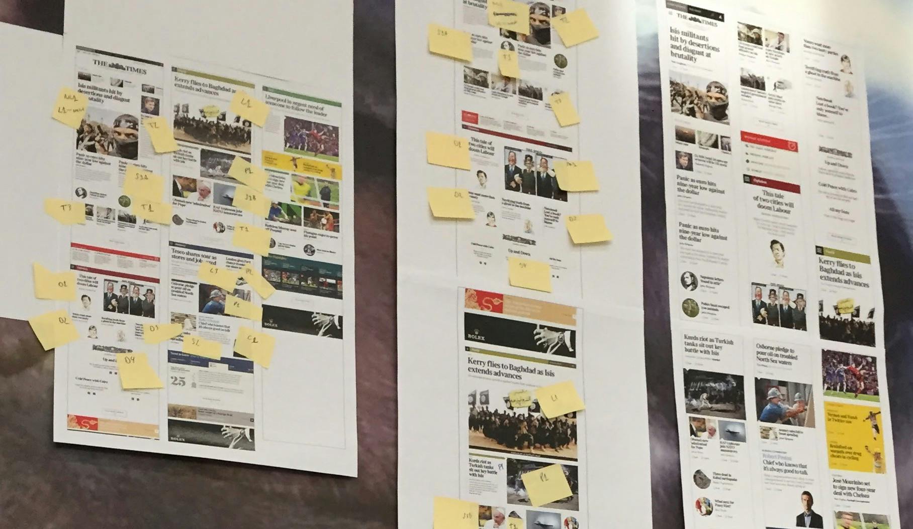
We printed and annotated the designs, creating a common language between design and tech. This would help us communicate better and establish consistency through our components.
By working closely with the design team I was able to define the UI structure, especially for the homepage.
Collaborating with visual and UX designers is such an important step! I ❤ collaboration.
UI Structure
The goal was to keep the UI structure as simple as possible. Unfortunately this is not as easy as it seems but I’m confident that we’ve achieved an impressive level of simplicity.
The UI is separated into Components, Modules and Global elements.
Components
Components are very low level, they can be used in a variety of different places and in different context. Ideally, we’d want a component to have very similar rendering wherever it’s used. Components don’t usually have a heavy impact on the layout. For example, a component wouldn’t necessarily be aware of how many grid columns it is spanning.
Examples of Components are:
- Buttons
- Labels
- Headlines
Modules
Modules are more complex than Components. Modules can have a significant impact on layout, they are usually aware of how they sit on the grid and how they need to respond on different breakpoints. Modules are not always reusable, for example, the Global Nav module will only ever be used once.
Examples of modules are:
- Sections
- Slices & Slice Items
- Related links
- Key facts
Globals
Global files are where we would set some default rules for certain elements, utility helpers and variables.
Markup
There are two different ways to use a Component:
- Good ol’ plain HTML As our Components are essentially “CSS classes”, you can use it by writing HTML with the right class(es).
- Component helper We are using Dust.js as our templating language as it can render our views on the server and client side. Dust.js allows us to create custom helpers, so we took advantage of this to create an uiComponent Helper.
In the following snippets, I share the Dust.js uiComponent Helper
/**
 * Function to render a ui component
 * @param  params - any available parameters allowed
 * @param  params.name
 * @return {partial}
 */
dust.helpers.uiComponent = function (chunk, context, bodies, params) {
  var name = context.resolve(params.name);
  return chunk.partial("components/" + name + "/" + name, context, params);
};
Here’s is an example of including components as HTML and via the Dust.js Helper:
<div>
  <h2 class="Headline Headline--m">News headline</h2>
  {@uiComponent name="byline" text="Tim Shipman, Political Editor" /};
  {@uiComponent name="dip" text="First paragraph of news content will go here..." /};
  {@uiComponent name="link" text="Read full story" modifider="primary" /};
</div>
Having a uiComponent Helper is great because it ensures that every instance of each component will be using the exact same markup. Furthermore it creates a single source of truth for each component and if we need to update the markup, we only need to update one file.
CSS
I wanted to share with you some of the CSS structure we utilised and the approach we took.
Naming convention
For the CSS naming convention we are using SUIT CSS. Here are some examples of SUIT CSS syntax:
ComponentName
ComponentName--modifierName
ComponentName-descendentName

is-*
u-*
We have also slightly extended it to support the following classes:
has-*
no-*
js-*
Breakpoints
We tried to keep the number of breakpoints down to a minimum to avoid unnecessary complexity, however, we wanted a flexible solution which would allow us to scale up, or define custom breakpoints if a specific module needed one.
As we decided to use Susy 2 to power our grid system, the way we define the breakpoints is using a mixin called susy-breakpoint, this is built on top of the famous Breakpoint Sass plugin.
Below is a snippet of our breakpoints:
// Defining breakpoints
$bp-medium: 768px !default;
$bp-wide: 1024px !default;

// Defining container widths
$container-medium: 860px !default;
$container-wide: 1024px !default;
And here is an example of our Susy settings:
// Defining grid columns
$g-small: 6 !default;
$g-wide: 12 !default;

// http://susydocs.oddbird.net/en/latest/settings/
$susy: (
  columns: $g-small,
  gutter-position: inside,
  gutters: 0,
  global-box-sizing: border-box,
  debug: (
    image: hide,
    color: rgba(blue, 0.1),
  ),
  use-custom: (
    box-sizing: false,
  ),
);

$susy-medium: $container-medium $g-wide (0) inside;
$susy-wide: $container-wide $g-wide (0) inside;
We also created some helper mixins to help us use the mixins easily and efficiently. Below is an example of our breakpoint settings:
// Defining media query helpers
// Aliases for susy-breakpoint
// http://susydocs.oddbird.net/en/latest/toolkit/#breakpoint
@mixin medium {
  @include susy-breakpoint($bp-medium, $susy-medium) {
    @content;
  }
}

@mixin to-medium {
  @include susy-breakpoint(0 ($bp-medium - 1), $susy-small) {
    @content;
  }
}

@mixin medium-only {
  @include susy-breakpoint($bp-medium($bp-wide - 1), $susy-medium) {
    @content;
  }
}

@mixin wide {
  @include susy-breakpoint($bp-wide, $susy-wide) {
    @content;
  }
}

@mixin to-wide {
  @include susy-breakpoint(0 ($bp-wide - 1), $susy-wide) {
    @content;
  }
}

@mixin wide-only {
  @include susy-breakpoint($bp-wide($bp-huge - 1), $susy-wide) {
    @content;
  }
}
Grid
The grid is powered by Susy 2, if you haven’t heard of it, I’d highly recommend you go check it out. In the past, I’ve built dozens of grid systems from scratch, but in this case, using Susy has saved tons of time. Susy is extremely flexible, you can literally build any grid you want on top of it, Susy just does the maths!
I created some mixins around the default Susy API though, as I wanted a custom setup to support a fallback for browsers without flexbox support. More on this in a bit.
The grid is pretty straight forward, it’s 6 columns on mobile and 12 columns on larger devices.
Here is a demo usage:
@mixin tt-span($pattern) {
  width: span($pattern);

  // For no flex browsers...
  .#{$no-flex} & {
    float: left;
  }
}
/**
* dummy-module.scss
*
* This example shows a module which spans:
* 3 columns on mobile (mobile first approach)
* 4 columns on tablet
* 3 columns on desktop
*/
.DummyModule {
@include tt-span(3);
@include medium {
@include tt-span(4);
}
@include wide {
@include tt-span(3);
}
}Slices and Slice Items
The homepage of The Times is essentially a combination of different Slices. We created about 20 different variations that will display news content in a different way, based on number of stories and importance.
**Slices **A slice is simply an element that wraps a Slice Item. Slices are built to be as dumb as possible.
**Slice Items **A Slice Item must always live inside a Slice element. Essentially, a Slice Item is where the news content lives. Each Slice Item is extended with a Slice Item Identifier, these identifiers are also used in the designs, you’ll see them labeled below as Nl1, T2, S1a, T1, etc.
Below is an example of how Slices and Slice Items look like in their simplest form.
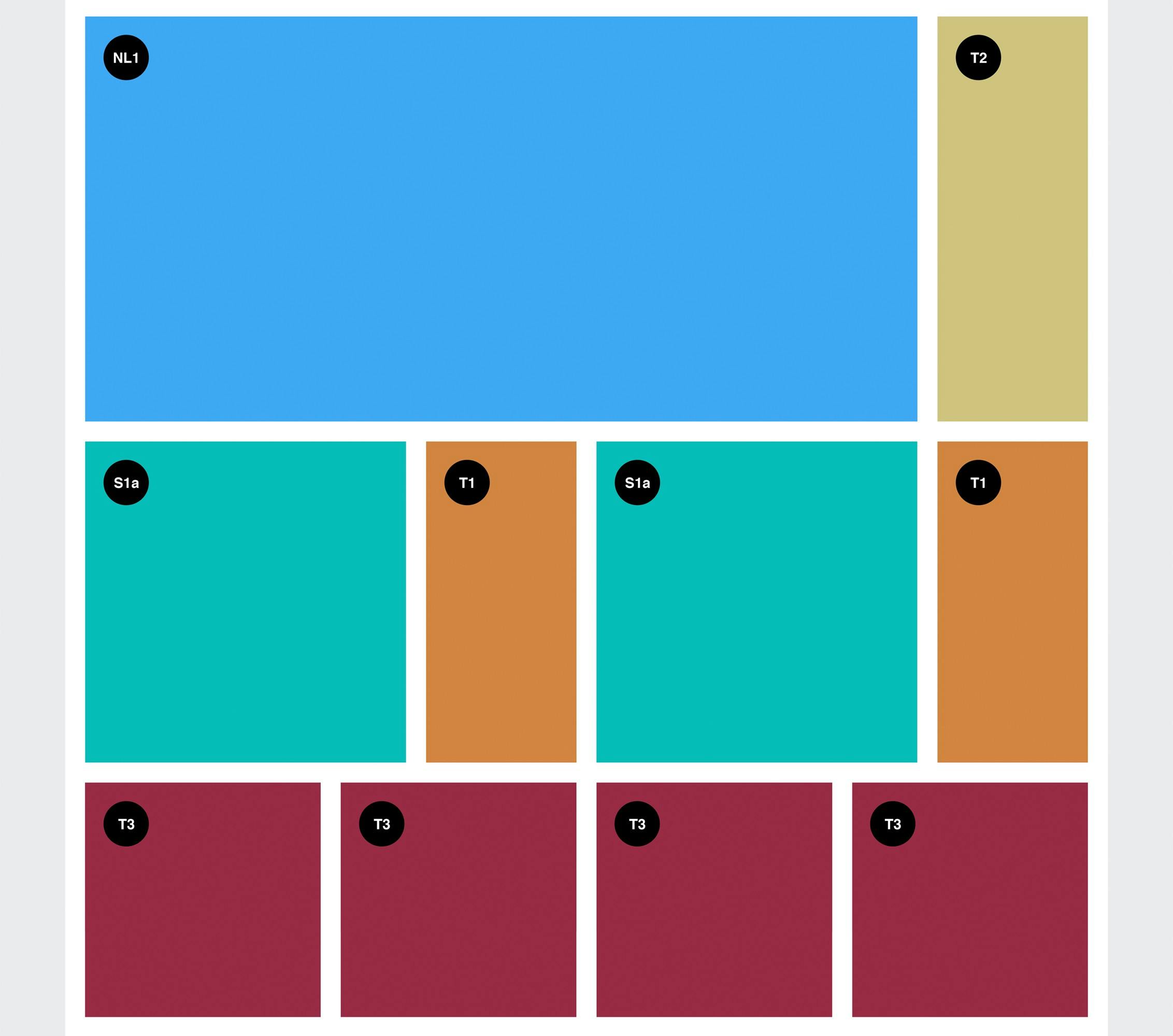
Using the pattern above meant we could have a consistent structure for all the slice items and a very simple approach.
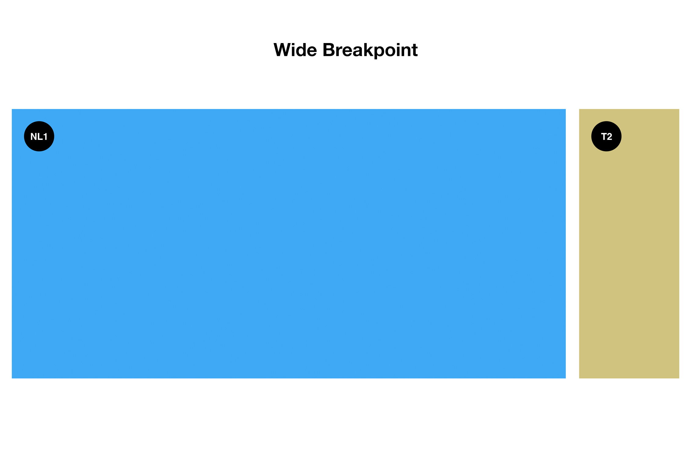
The code below demonstrates how to replicate the first Slice (*NL1 + T2) *from the design above into code:
<div class="Slice">
  <div class="Item NL1"></div>
  <div class="Item T2"></div>
</div>
/**
*
* NL1 Module
*
**/
.NL1 {
@include medium {
@include tt-span(9);
}
@include wide {
@include tt-span(10);
}
}/**
*
* T2 Module
*
**/
.T-2 {
@include medium {
@include tt-span(3);
}
@include wide {
@include tt-span(2);
}
}As mentioned above in the Grid section, it consists of 12 columns for Medium and Wide breakpoints. With that in mind, all we need to do in the CSS is to specify how many columns each Slice Item spans, bearing in mind the addition of the columns must equal 12.
In plain english, the code above is doing this:
NL1 Slice Item* *Medium breakpoint = 9 columns Wide breakpoint = 10 columns
T2 Slice Item* *Medium breakpoint = 3 columns Wide breakpoint = 2 columns
For mobile both modules span 100%. Here’s a GIF illustrating the final result:
Refactor
Refactor, refactor, refactor… in my opinion this is by far the most crucial step to get things done right. Adding a refactoring step to our process meant that we could clean up after ourselves. It’s common that the first time you write some code, it’s not going to be perfect or it’s not going to reflect the logic very well. By giving yourself some time to refactor your code, you can make the code more concise, optimised and maintainable.
Visual QA
Another really important step in our process is to do Visual QA. This is basically as simple as sitting down with a designer and going through the UI components, making sure they’re looking and working as expected. This is a great workflow, because it means you can build the component as per the design, but it allows you to “refine in the browser”. It really doesn’t take a long time to do Visual QA, as the changes expected from this are minimal, but it does make a huge difference in the overall result.
Styleguide
With every great build there is a Styleguide. It is currently WIP, but you can get an idea of our components and how they can be used.
Conclusion
Websites like The Times will be live for many years to come and who knows how many developers will work on it, so setting up the initial structure can be scary. By defining a convention and a structure you can make it much more maintainable and scalable.
A huge benefit of creating Components and Modules is that your code is encapsulated. In my opinion, this is one of the most important things about large builds. It ensures that a change in a specific CSS file will only affect that Component/Module and not have any side-effect on other elements.
Overall, the approach used in this project is extremely simple. What makes it powerful is how we structure our code. Choosing a naming convention and going for a component based approach will automatically forced us to think in a more object oriented way.
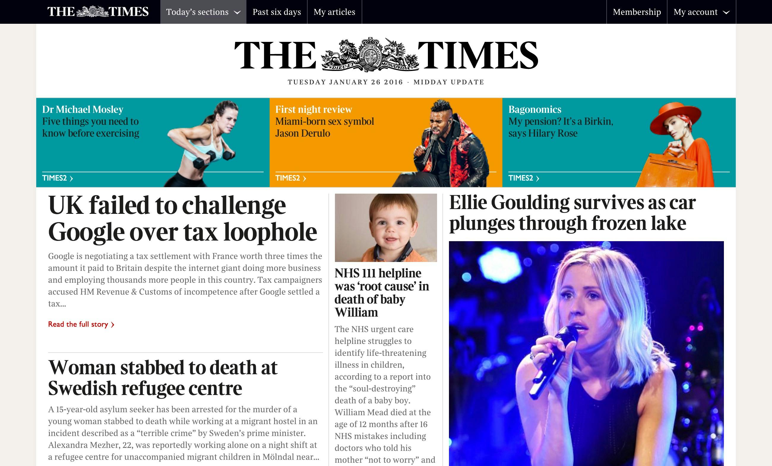
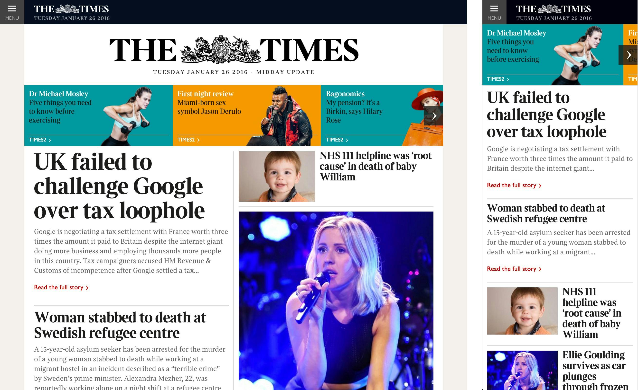
And finally, here are some screenshots of the live version:
Thanks for reading. Find me on Twitter 🐤
👋